Collapsing the Lighthouse ticket form
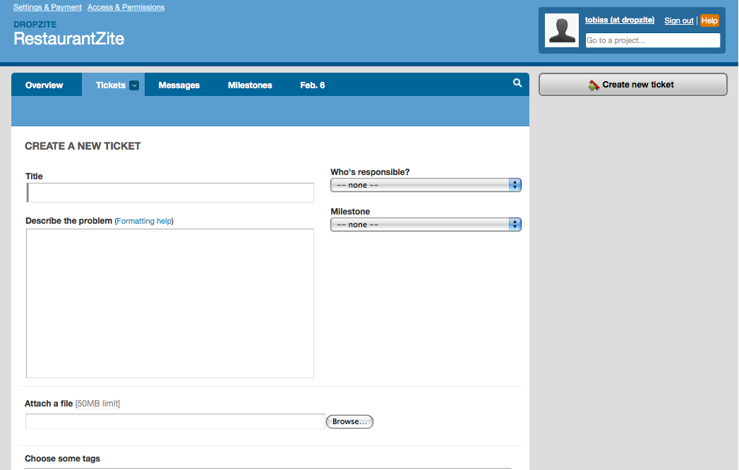
We’ve been using lighthouse for the last few months to track bugs/features for RestaurantZite. Overall, its a pretty good bug tracker; not great, but good. One thing that bothers me about it is the expansive nature of the ticket entry/edit form:

Usually, my browser is sized to where the submit button is off of the bottom of the screen, as well as the tag input. The description box is larger than it needs to be (for our use anyway, since we are describing bugs for ourselves and can usually capture it in sentence or two), and the whitespace to the right of the description seems wasted.
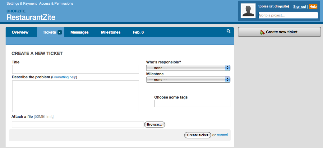
To help with this, I wrote a custom stylesheet that turns the above form into:

Its not perfect, but works for me. I compacted the header and the subtab row as well, which will be reflected on all of the pages. I also compacted the ticket view page (which has this form at the bottom for updates) to reduce its vertical space usage.
The css is available for Firefox on userstyles.org for the Stylish plugin, or as a gist. I haven’t tried it in Safari or an SSB, so let me know how it works or what changes you had to make if you do.
![[atom feed]](/feed.png)

